

Blog
Table of Contents
Mobile-First Website Design Explained: A Comprehensive Guide for UK Businesses
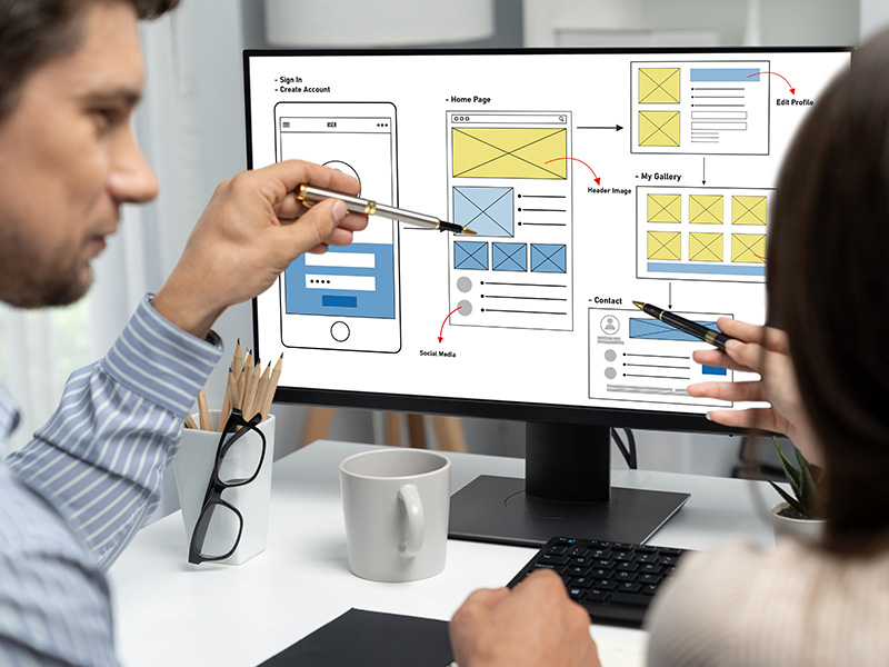
In modern web development, mobile-first website design reverses this paradigm by designing the core user experience for the smallest screens first and progressively enhancing it for larger desktop displays.
Quick Summary: What Is Mobile-First Design?
- Better Search Engine Visibility: Aligns directly with Google's Mobile-First Indexing requirement.
- Faster Loading Times: Eliminates bloated scripts and unnecessary desktop assets.
- Higher Conversion Rates: Simplifies user journeys and call-to-action touchpoints.
- Superior User Experience: Ensures buttons, forms, and menus are thumb-friendly.
Mobile-First vs Desktop-First Comparison
| Feature / Factor | Mobile-First Approach | Desktop-First Approach |
|---|---|---|
|
Design Starting Point |
Smallest screens (Smartphones ~320px–480px) | Large monitors (Desktop ~1200px–1920px) |
|
Development Philosophy |
Progressive Advancement (build up) | Graceful Degradation (scale down) |
|
SEO Impact |
Optimised for Google Mobile-First Indexing | Risk of ranking drops due to mobile performance issues |
Frequently Asked Questions About Website Build Timelines
Is mobile-first design the same as responsive web design?
Not quite. Responsive web design is the technical technique of using fluid grids and CSS media queries so a site adjusts to screen sizes. Mobile-first design is a strategic design process that begins with the mobile interface before designing for desktop screens.
Upgrade Your Website to a Mobile-First Architecture
Build Smarter Websites with AI Technology
Build and host your website with AI—fast, simple, and secure.
Why Build & Host with Get Website?
AI-Powered Setup
Launch your site effortlessly with AI-generated design & content.
Fast & Secure Hosting
Blazing speed, security, and daily backups included.
All-in-One Platform
Design, build, and host without tech hassle.