

Blog
Table of Contents
Responsive Website Design Explained: A Complete Guide for UK Businesses
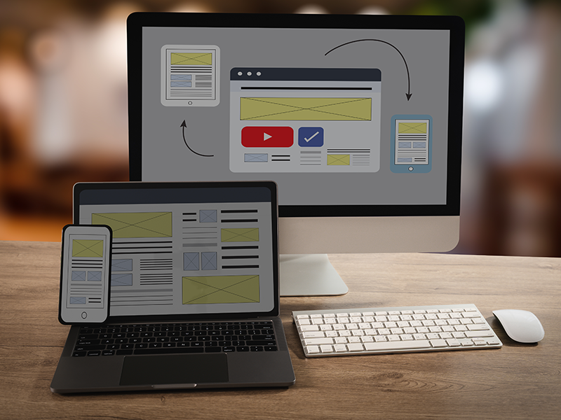
Responsive website design explained: In today’s digital landscape, more than 60% of UK web traffic comes from mobile devices. Understanding responsive website design is essential for improving user experience, SEO, and business growth.
In today’s digital landscape, more than 60% of web traffic in the UK originates from mobile devices and tablets. If your website fails to adjust seamlessly to varying screen sizes, potential customers will quickly leave for a competitor’s site. This is where responsive website design becomes essential.
Responsive web design is an approach to web development that allows a website’s layout, images, and elements to dynamically adapt based on the screen resolution and orientation of the device being used.
Quick Summary: What Is Responsive Web Design?
- One Website, Every Device: Replaces the outdated need for separate desktop and "m." mobile websites.
- SEO Advantage: Google uses mobile-first indexing, meaning your mobile responsiveness directly impacts search rankings.
- Improved Conversions: Eliminates awkward horizontal scrolling, tiny touch targets, and distorted layouts.
Comparing Design Approaches: Responsive vs Adaptive vs Mobile-First
|
Feature |
Responsive Design |
Adaptive Design |
Mobile-First Design |
|---|---|---|---|
|
Core Concept |
Fluid, continuous scaling across all screen sizes. |
Serves distinct static templates for specific device sizes. |
Designs for mobile screens first, expanding features for desktop. |
|
Maintenance |
Single codebase; lower maintenance effort over time. |
Multiple layouts to update and manage independently. |
Single codebase built progressively from small to large viewports. |
Frequently Asked Questions
What is the difference between mobile-friendly and responsive?
A mobile-friendly site displays properly on mobile devices, but it may simply be a scaled-down static version of a desktop site. A responsive site dynamically rearranges, resizes, and alters its layout to offer an optimized experience tailored to the precise screen size being used.
What is responsive website design?
Responsive website design automatically adjusts your website’s layout, images, and content to fit desktops, tablets, and smartphones.
Transform Your Business with Professional Responsive Design
At GetWebsite.io, we craft custom, high-speed responsive websites for businesses across the UK.
Build Smarter Websites with AI Technology
Build and host your website with AI—fast, simple, and secure.
Why Build & Host with Get Website?
AI-Powered Setup
Launch your site effortlessly with AI-generated design & content.
Fast & Secure Hosting
Blazing speed, security, and daily backups included.
All-in-One Platform
Design, build, and host without tech hassle.