

banner_img3

Blog

Table of Contents

The Importance of Responsive Website Design
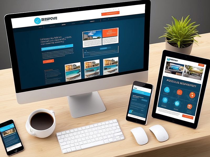
The Importance of Responsive Website Design

Introduction

In today’s digital world, people browse the internet using a wide range of devices, including smartphones, tablets, laptops, and desktop computers. If your website doesn’t display correctly on every screen size, you could be losing valuable customers.
This is where responsive website design becomes essential. A responsive website automatically adjusts its layout, images, and content to provide the best possible experience on any device.
Whether you run a small business, an online store, or a large organisation, a responsive website is no longer a luxury—it’s a necessity. In this guide, we’ll explain why responsive website design is important and how it can help your business grow.

What Is Responsive Website Design?

The importance of responsive website design has grown significantly as more users browse websites on smartphones and tablets. A responsive website ensures that visitors enjoy a seamless experience on every device.

Businesses understand responsive website design because it improves customer engagement, reduces bounce rates, and increases conversions.

Responsive website design is an approach to web development that ensures a website automatically adapts to different screen sizes and devices.

Instead of creating separate websites for desktop and mobile users, one responsive website provides a consistent experience across:
Visitors can easily browse your website without needing to zoom, scroll horizontally, or struggle with navigation.

Better User Experience

User experience (UX) plays a major role in the success of your website.

A responsive website makes it easier for visitors to:

When visitors enjoy using your website, they are more likely to stay longer and become customers.

Mobile Usage Continues to Grow

More than half of all internet traffic now comes from mobile devices.
People search for products and services while travelling, shopping, or relaxing at home. If your website doesn’t work properly on a smartphone, many visitors will leave and visit a competitor instead.
A responsive website ensures every visitor receives the same high-quality experience regardless of the device they use.

Improved Google Rankings

Google uses mobile-first indexing, meaning it primarily evaluates the mobile version of your website when determining search rankings.
A responsive website helps improve SEO by providing:

These factors can increase your visibility in Google search results and attract more organic traffic.

Faster Website Performance

Responsive websites are typically designed with performance in mind.
By optimising:
your website loads more quickly across all devices.
Faster websites improve customer satisfaction and can lead to higher conversion rates.

Higher Conversion Rates

The easier it is for visitors to use your website, the more likely they are to take action.

Whether your goal is to:

a responsive design removes barriers and creates a smoother customer journey.
Better usability often leads to more conversions and increased revenue.

Consistent Brand Experience

Your website represents your brand.
A responsive website ensures your branding remains consistent across every device by displaying:
This consistency helps build trust and creates a more professional impression.

Easier Website Management

Years ago, businesses often maintained separate desktop and mobile websites.
Responsive design eliminates this need by allowing you to manage a single website.
This means:
Updating one website is much more efficient than maintaining multiple versions.

Cost-Effective Solution

Although responsive website design may require more planning during development, it saves money over time.
Instead of building and maintaining separate mobile and desktop websites, one responsive website works across all devices.
This reduces:
making responsive design a smart long-term investment.

Supports Future Devices

Technology is constantly evolving, with new devices and screen sizes being introduced every year.
A responsive website is designed to adapt to future devices without requiring a complete rebuild.
This helps protect your investment and ensures your website remains functional as technology changes.

Better Local SEO

Many local searches happen on mobile devices.
People often search for services using phrases such as:
A responsive website improves the experience for these users and supports better local search performance.
Combined with strong SEO, responsive design can help your business attract more local customers.

Reduced Bounce Rate

If visitors struggle to use your website on their phone, they will often leave within seconds.

A responsive website encourages visitors to stay longer by providing:
A lower bounce rate signals to search engines that users find your website valuable.

Competitive Advantage

Your competitors are constantly improving their websites.
A responsive website helps your business remain competitive by providing a modern, professional experience that meets customer expectations.
Visitors are more likely to trust and engage with businesses that invest in quality website design.

Features of a Responsive Website

A professionally designed responsive website typically includes:
These features improve both user experience and website performance.

Frequently Asked Questions

What is responsive website design?
Responsive website design ensures your website automatically adjusts to different screen sizes, providing an excellent user experience on desktops, tablets, and smartphones.
It improves user experience, supports SEO, increases conversions, and ensures your website works well across all devices.
Yes. Google prefers mobile-friendly websites, and responsive design supports better rankings through improved usability and performance.
Yes. Many older websites can be redesigned or rebuilt to become fully responsive.
Try viewing your website on different devices or resize your browser window. If the layout adjusts automatically and remains easy to use, it is likely responsive.

Final Thoughts

Responsive website design is no longer optional—it’s a fundamental requirement for any successful business website. With more people browsing on mobile devices than ever before, your website must provide a fast, user-friendly experience regardless of screen size.
A responsive website helps improve customer satisfaction, strengthens your Google rankings, increases conversions, and supports long-term business growth.
At GetWebsite.io, we design and develop responsive websites that are fast, secure, SEO-friendly, and tailored to your business. Whether you need a brand-new website or want to modernise your existing one, our team is here to help you create a website that performs on every device.

Build Smarter Websites with AI Technology

Build and host your website with AI—fast, simple, and secure.

Why Build & Host with Get Website?

AI-Powered Setup

Launch your site effortlessly with AI-generated design & content.

Fast & Secure Hosting

Blazing speed, security, and daily backups included.

All-in-One Platform

Design, build, and host without tech hassle.